pacman::p_load(plotly, ggtern, tidyverse)hands-on exercise 5
Creating Ternary Plot with R
#Reading the data into R environment
pop_data <- read_csv("data/respopagsex2000to2018_tidy.csv")
#Deriving the young, economy active and old measures
agpop_mutated <- pop_data %>%
mutate(`Year` = as.character(Year))%>%
spread(AG, Population) %>%
mutate(YOUNG = rowSums(.[4:8]))%>%
mutate(ACTIVE = rowSums(.[9:16])) %>%
mutate(OLD = rowSums(.[17:21])) %>%
mutate(TOTAL = rowSums(.[22:24])) %>%
filter(Year == 2018)%>%
filter(TOTAL > 0)#Building the static ternary plot
ggtern(data=agpop_mutated,aes(x=YOUNG,y=ACTIVE, z=OLD)) +
geom_point()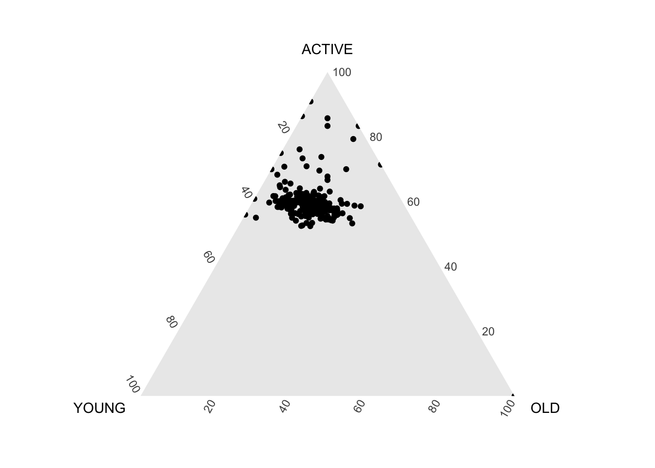
#Building the static ternary plot
ggtern(data=agpop_mutated, aes(x=YOUNG,y=ACTIVE, z=OLD)) +
  geom_point() +
  labs(title="Population structure, 2015") +
  theme_rgbw()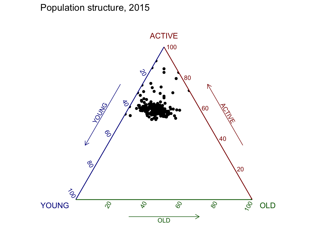
# reusable function for creating annotation object
label <- function(txt) {
  list(
    text = txt,
    x = 0.1, y = 1,
    ax = 0, ay = 0,
    xref = "paper", yref = "paper",
    align = "center",
    font = list(family = "serif", size = 15, color = "white"),
    bgcolor = "#b3b3b3", bordercolor = "black", borderwidth = 2
  )
}

# reusable function for axis formatting
axis <- function(txt) {
  list(
    title = txt, tickformat = ".0%", tickfont = list(size = 10)
  )
}

ternaryAxes <- list(
  aaxis = axis("Young"),
  baxis = axis("Active"),
  caxis = axis("Old")
)

# Initiating a plotly visualization
plot_ly(
  agpop_mutated,
  a = ~YOUNG,
  b = ~ACTIVE,
  c = ~OLD,
  color = I("black"),
  type = "scatterternary"
) %>%
  layout(
    annotations = label("Ternary Markers"),
    ternary = ternaryAxes
  )
Visual Correlation Analysis
pacman::p_load(corrplot, ggstatsplot, tidyverse)wine <- read_csv("data/wine_quality.csv")pairs(wine[,1:11])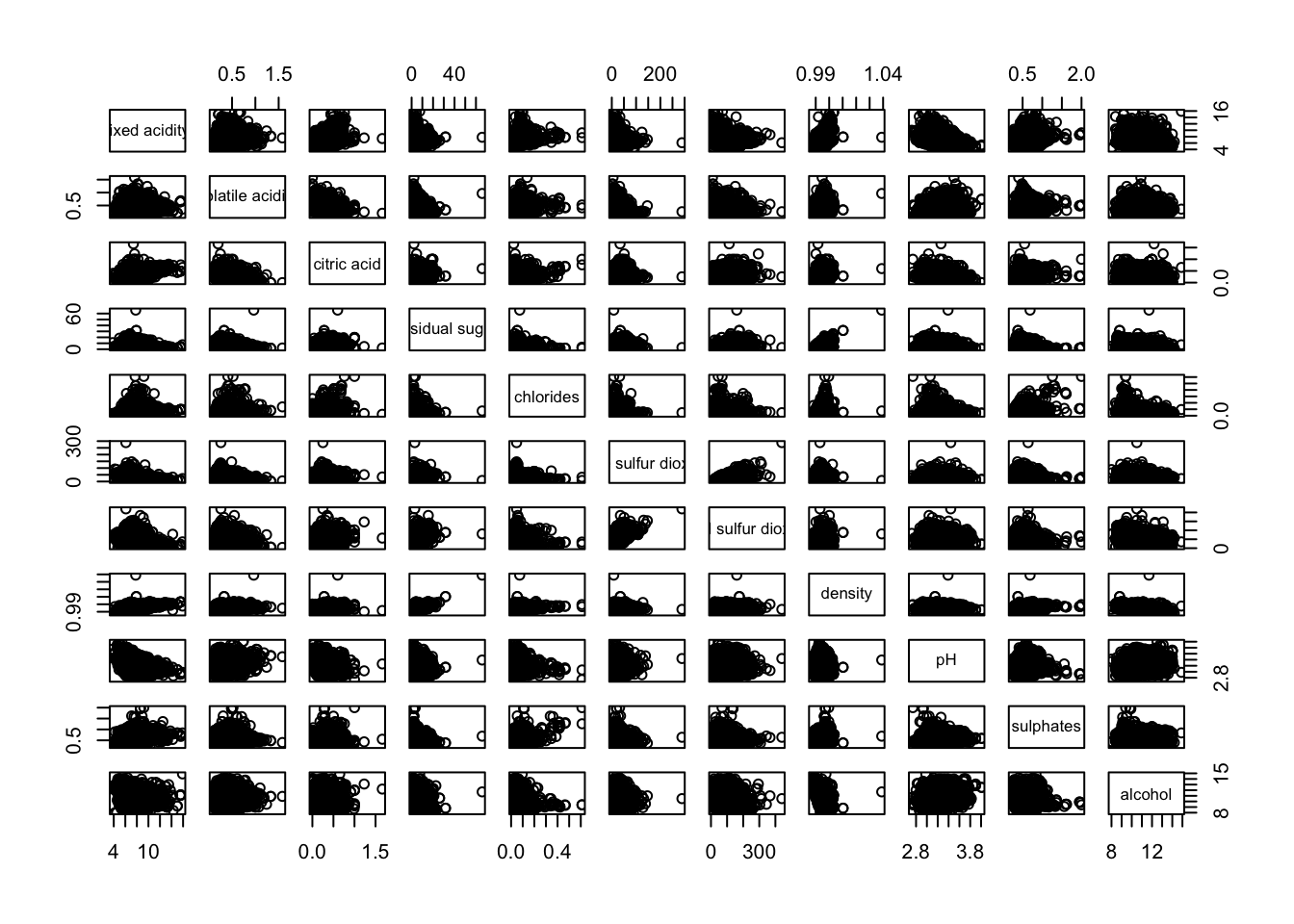
pairs(wine[,2:12])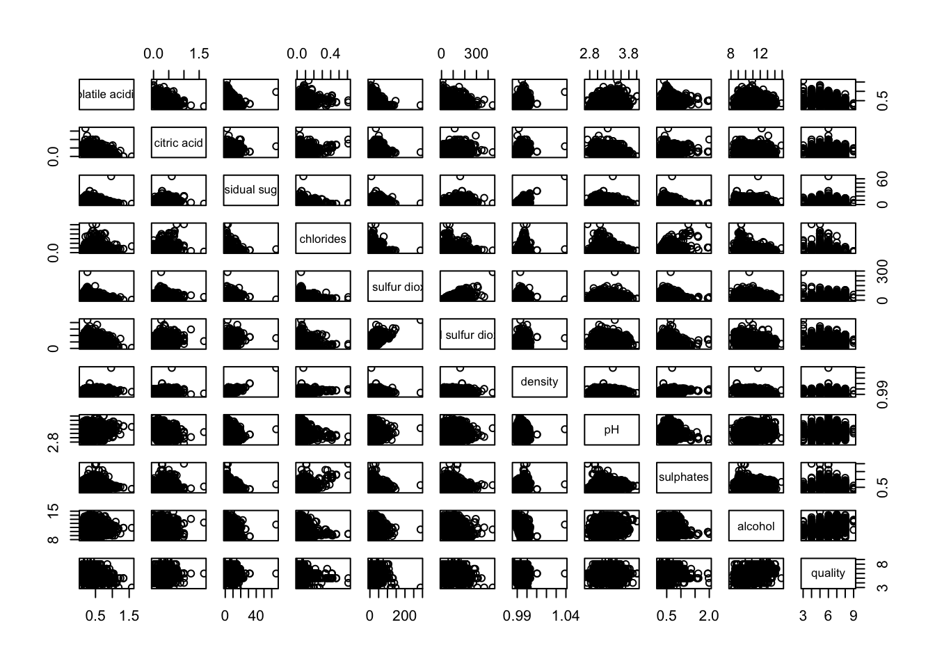
pairs(wine[,2:12], upper.panel = NULL)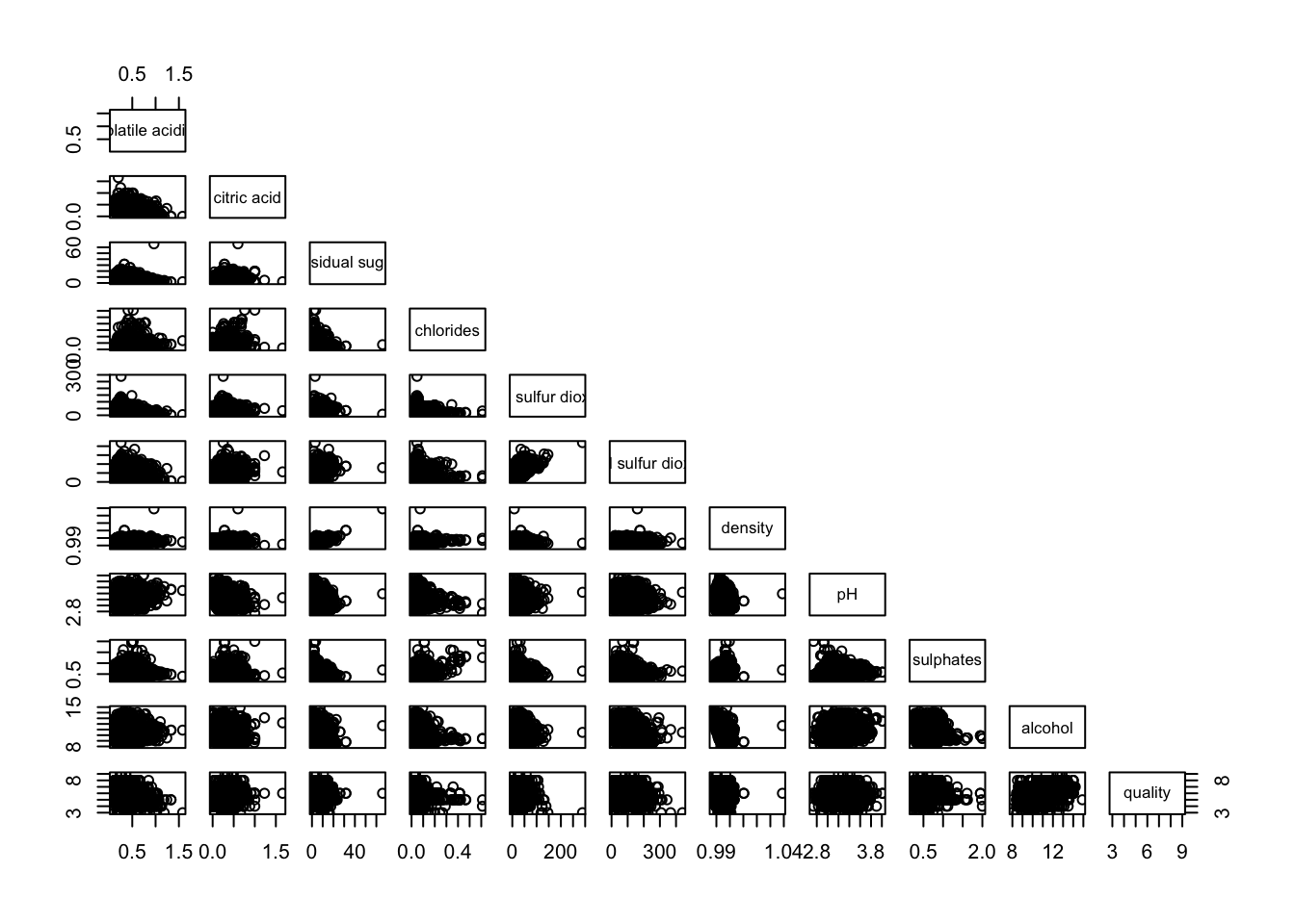
pairs(wine[,2:12], lower.panel = NULL)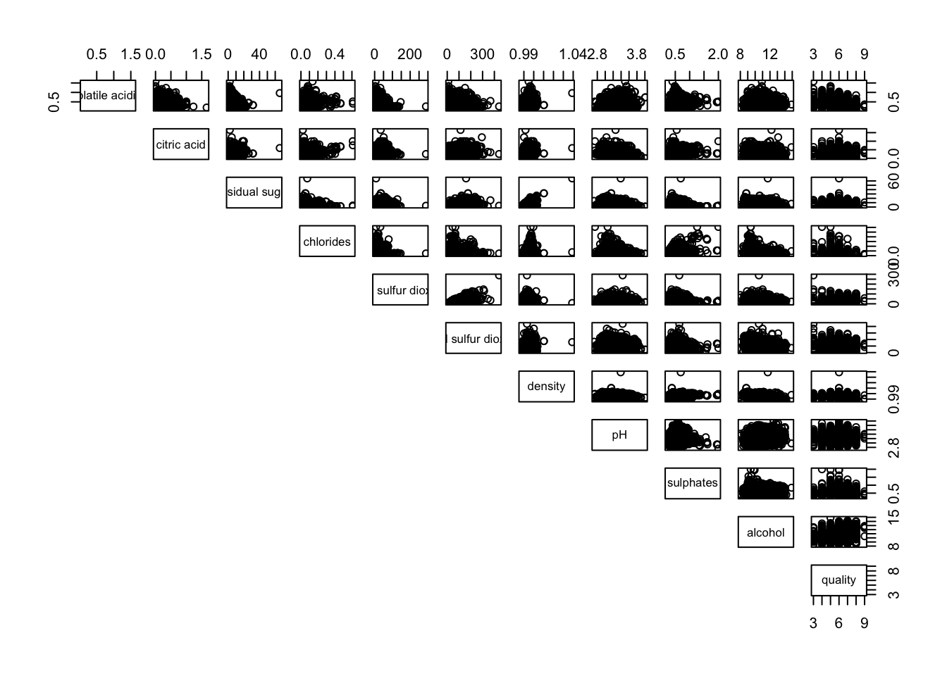
panel.cor <- function(x, y, digits=2, prefix="", cex.cor, ...) {
usr <- par("usr")
on.exit(par(usr))
par(usr = c(0, 1, 0, 1))
r <- abs(cor(x, y, use="complete.obs"))
txt <- format(c(r, 0.123456789), digits=digits)[1]
txt <- paste(prefix, txt, sep="")
if(missing(cex.cor)) cex.cor <- 0.8/strwidth(txt)
text(0.5, 0.5, txt, cex = cex.cor * (1 + r) / 2)
}

pairs(wine[,2:12],
      upper.panel = panel.cor)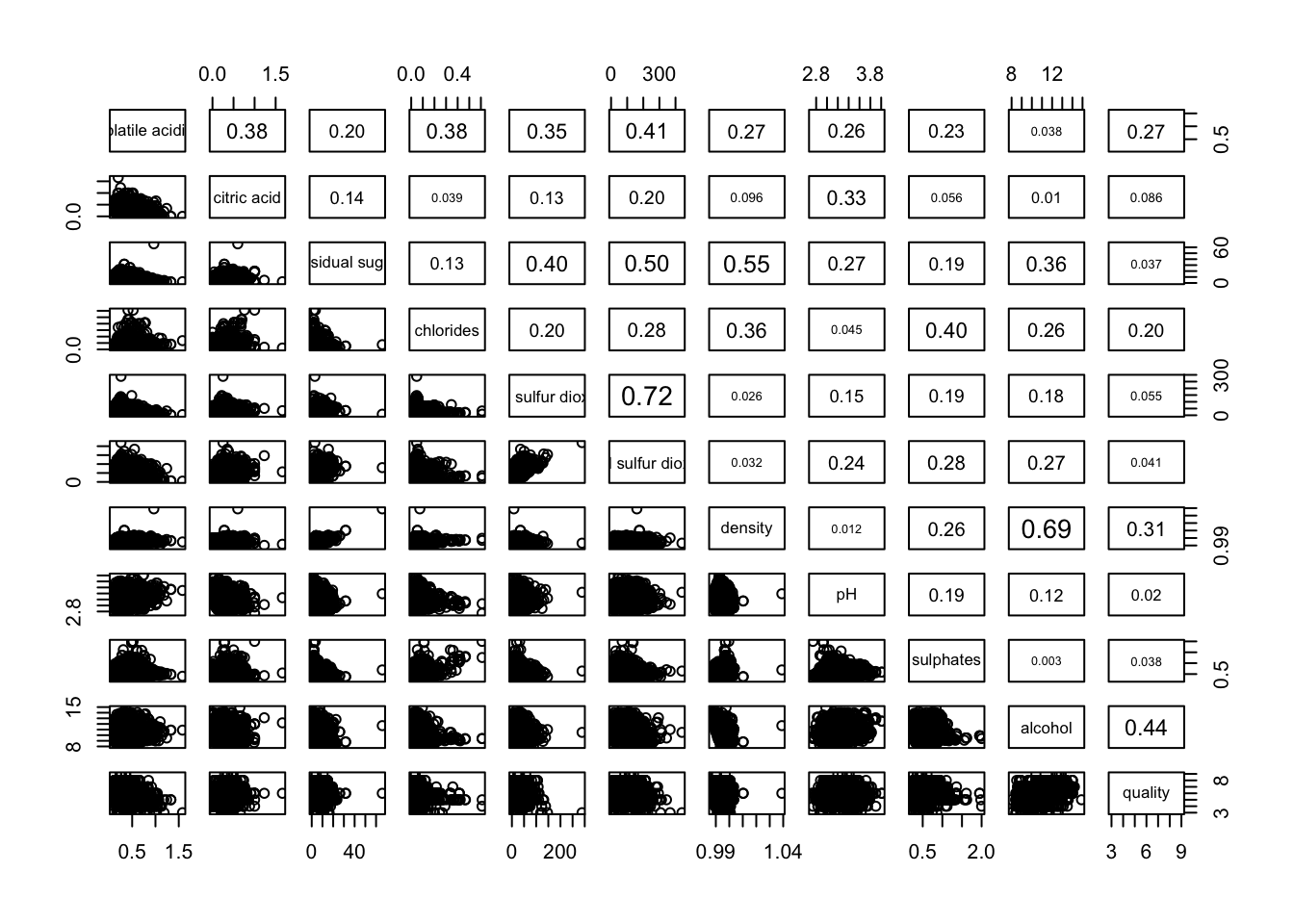
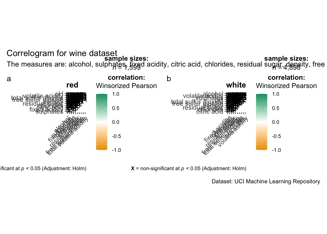
grouped_ggcorrmat(
  data = wine,
  cor.vars = 1:11,
  grouping.var = type,
  type = "robust",
  p.adjust.method = "holm",
  plotgrid.args = list(ncol = 2),
  ggcorrplot.args = list(outline.color = "black",
                         hc.order = TRUE,
                         tl.cex = 10),
  annotation.args = list(
    tag_levels = "a",
    title = "Correlogram for wine dataset",
    subtitle = "The measures are: alcohol, sulphates, fixed acidity, citric acid, chlorides, residual sugar, density, free sulfur dioxide and volatile acidity",
    caption = "Dataset: UCI Machine Learning Repository"
  )
)
wine.cor <- cor(wine[, 1:11])corrplot(wine.cor)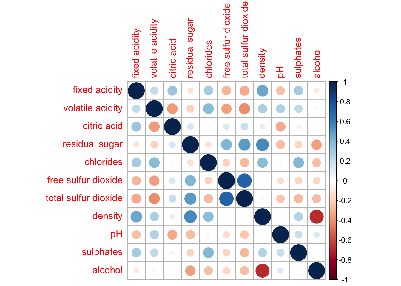
corrplot(wine.cor,
         method = "ellipse",
         type="lower")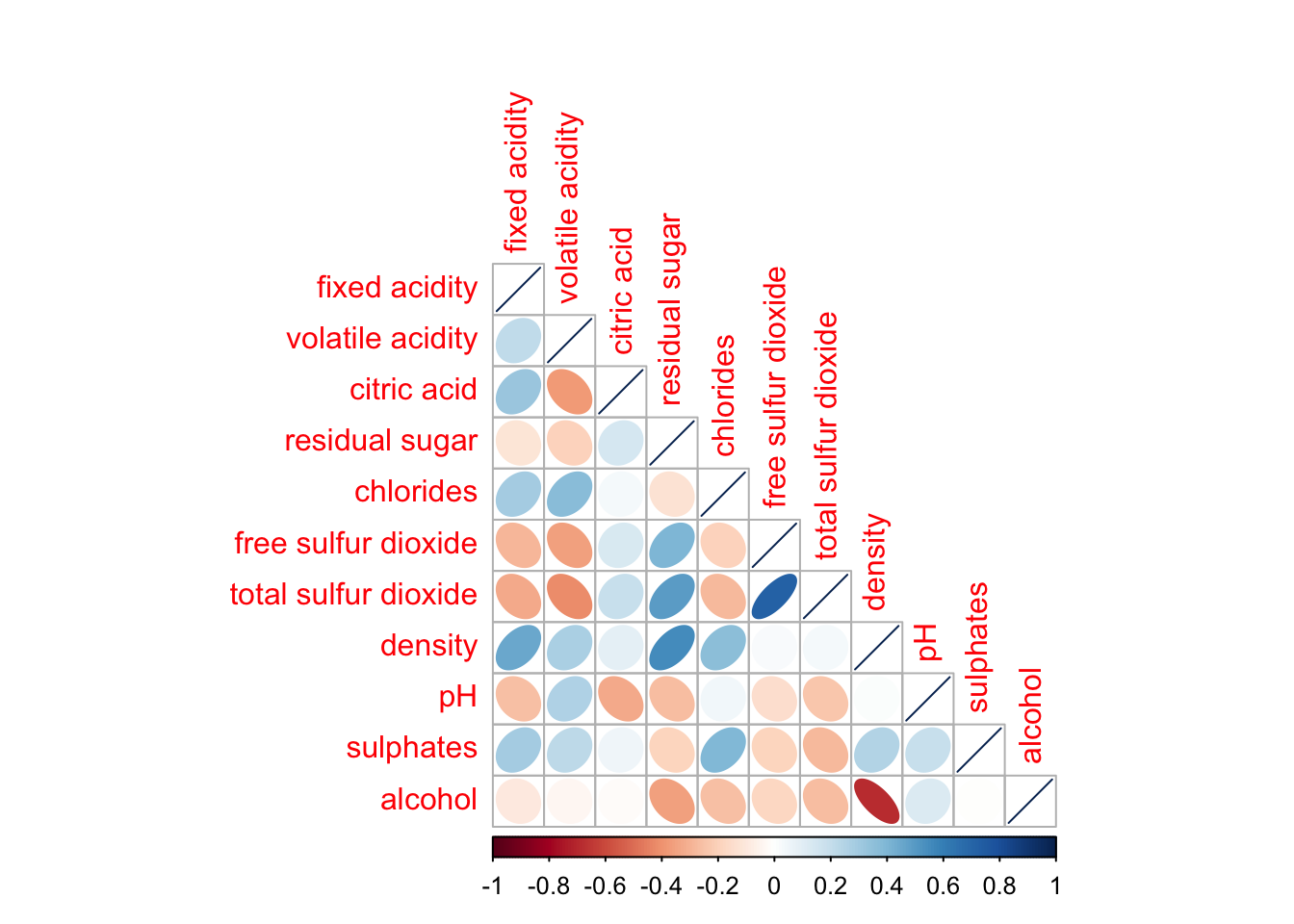
corrplot(wine.cor,
         method = "ellipse",
         type="lower",
         diag = FALSE,
         tl.col = "black")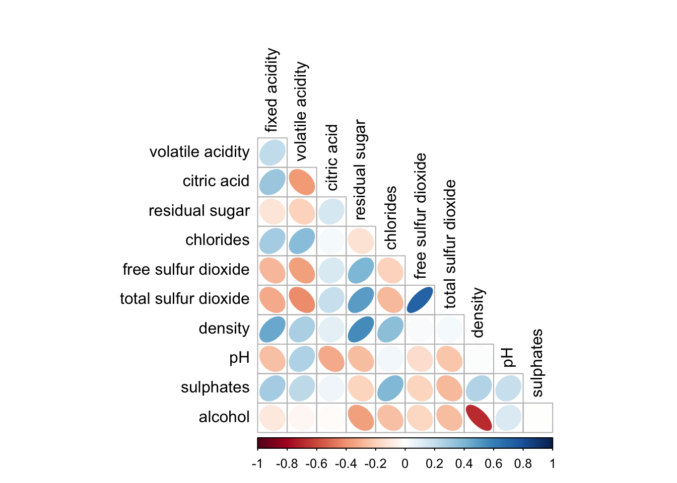
corrplot.mixed(wine.cor,
               lower = "ellipse",
               upper = "number",
               tl.pos = "lt",
               diag = "l",
               tl.col = "black")
corrplot.mixed(wine.cor,
               lower = "ellipse",
               upper = "number",
               tl.pos = "lt",
               diag = "l",
               tl.col = "black")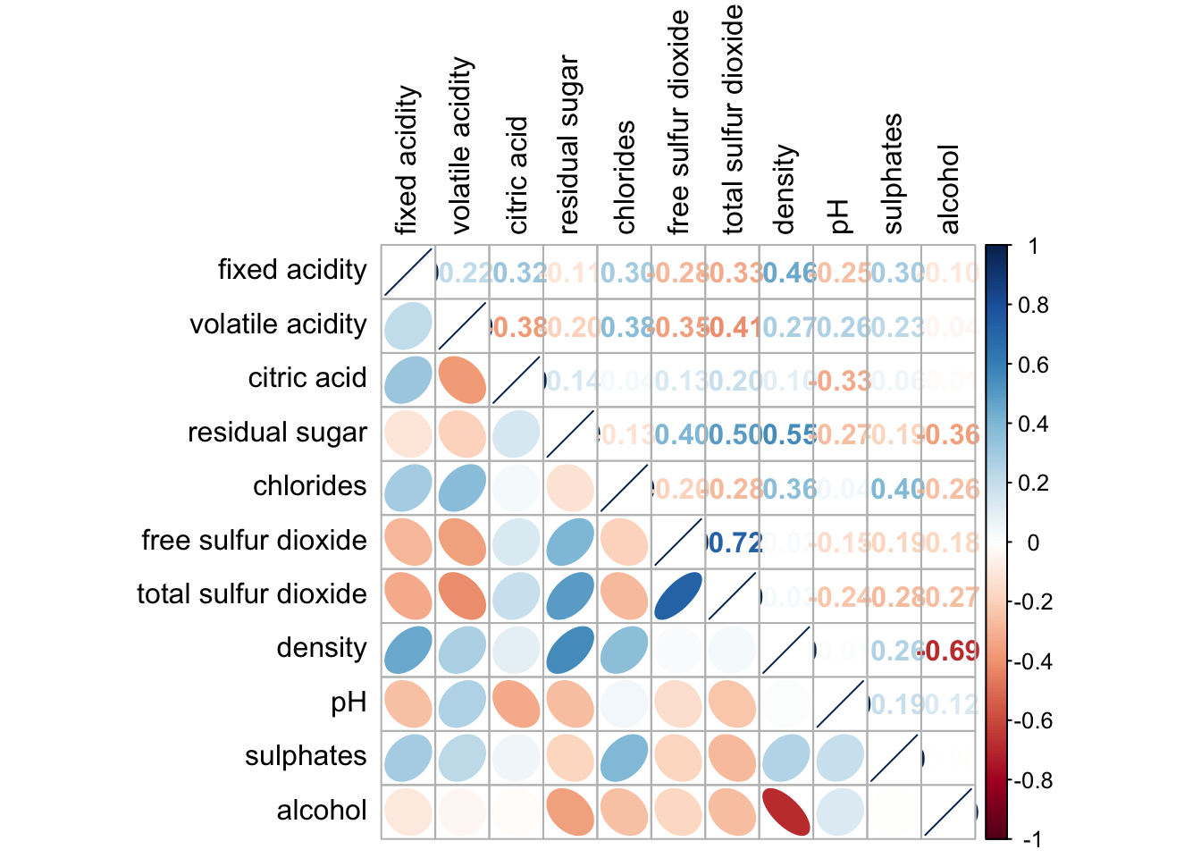
wine.sig = cor.mtest(wine.cor, conf.level= .95)corrplot(wine.cor,
method = "number",
type = "lower",
diag = FALSE,
tl.col = "black",
tl.srt = 45,
p.mat = wine.sig$p,
sig.level = .05)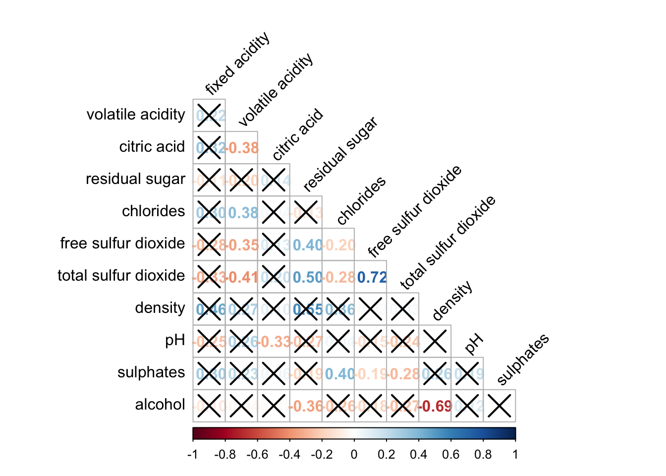
corrplot.mixed(wine.cor,
               lower = "ellipse",
               upper = "number",
               tl.pos = "lt",
               diag = "l",
               order="AOE",
               tl.col = "black")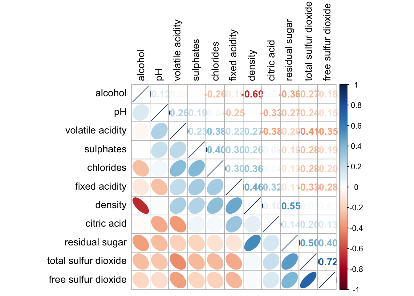
corrplot(wine.cor,
         method = "ellipse",
         tl.pos = "lt",
         tl.col = "black",
         order="hclust",
         hclust.method = "ward.D",
         addrect = 3)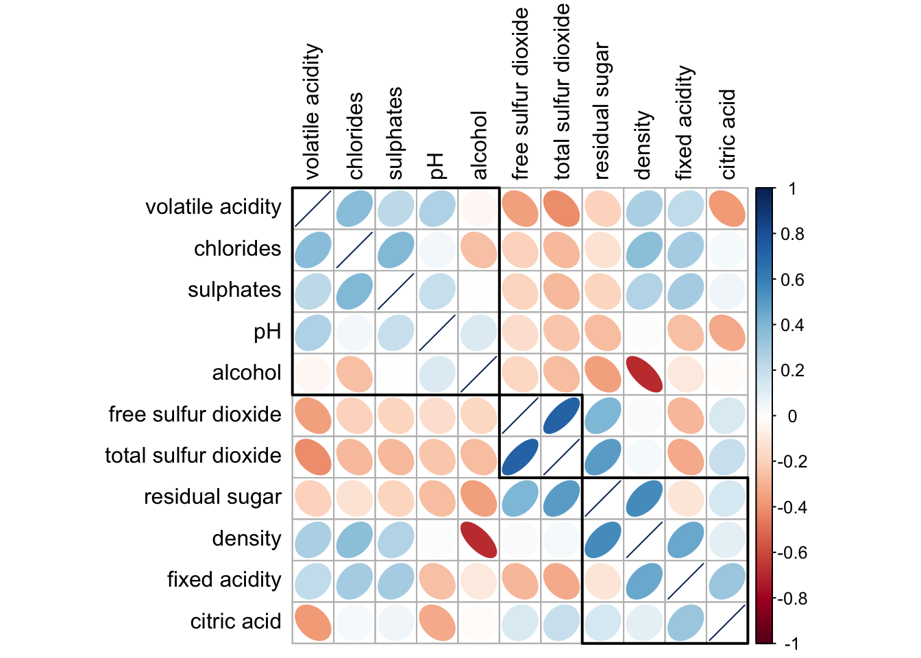
Heatmap for Visualising and Analysing Multivariate Data
pacman::p_load(seriation, dendextend, heatmaply, tidyverse)wh <- read_csv("data/WHData-2018.csv")wh1 <- dplyr::select(wh, c(3, 7:12))
wh_matrix <- data.matrix(wh)wh_heatmap <- heatmap(wh_matrix,
Rowv=NA, Colv=NA)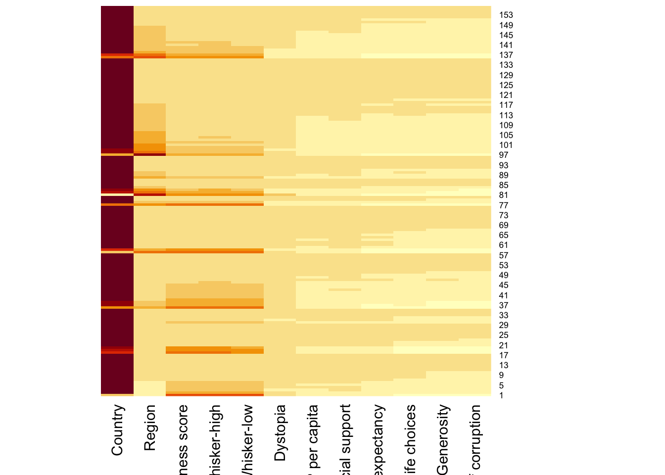
wh_heatmap <- heatmap(wh_matrix)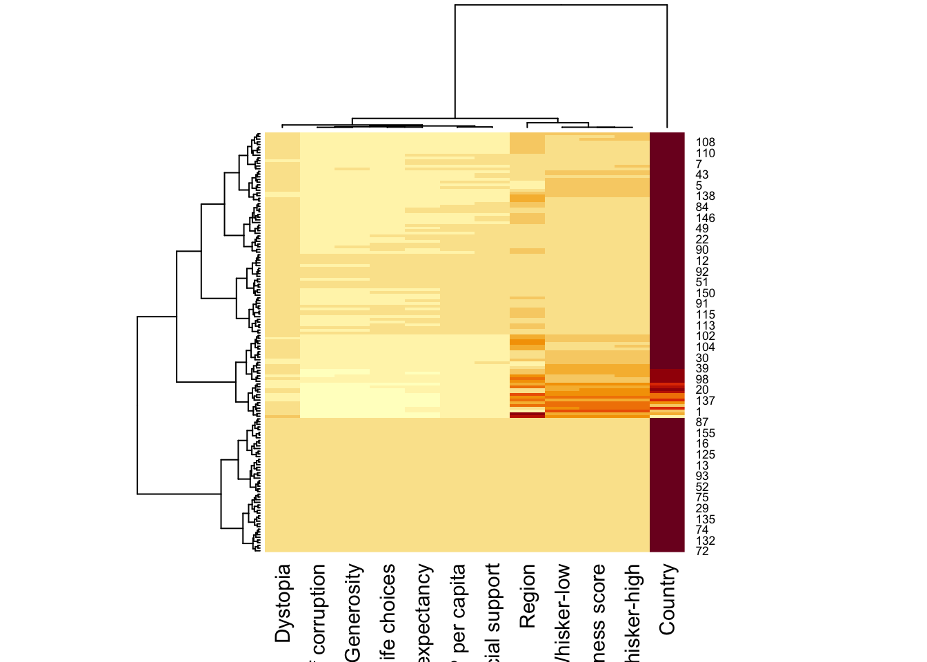
wh_heatmap <- heatmap(wh_matrix,
                      scale="column",
                      cexRow = 0.6,
                      cexCol = 0.8,
                      margins = c(10, 4))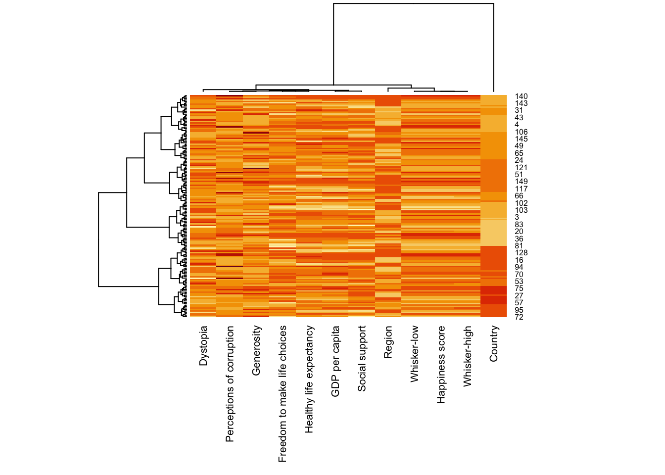
heatmaply(mtcars)heatmaply(wh_matrix[, -c(1, 2, 4, 5)],
scale = "column")heatmaply(normalize(wh_matrix[, -c(1, 2, 4, 5)]))heatmaply(normalize(wh_matrix[, -c(1, 2, 4, 5)]),
dist_method = "euclidean",
hclust_method = "ward.D")wh_d <- dist(normalize(wh_matrix[, -c(1, 2, 4, 5)]), method = "euclidean")
dend_expend(wh_d)[[3]] dist_methods hclust_methods optim
1 unknown ward.D 0.6137851
2 unknown ward.D2 0.6289186
3 unknown single 0.4774362
4 unknown complete 0.6434009
5 unknown average 0.6701688
6 unknown mcquitty 0.5020102
7 unknown median 0.5901833
8 unknown centroid 0.6338734wh_clust <- hclust(wh_d, method = "average")
num_k <- find_k(wh_clust)
plot(num_k)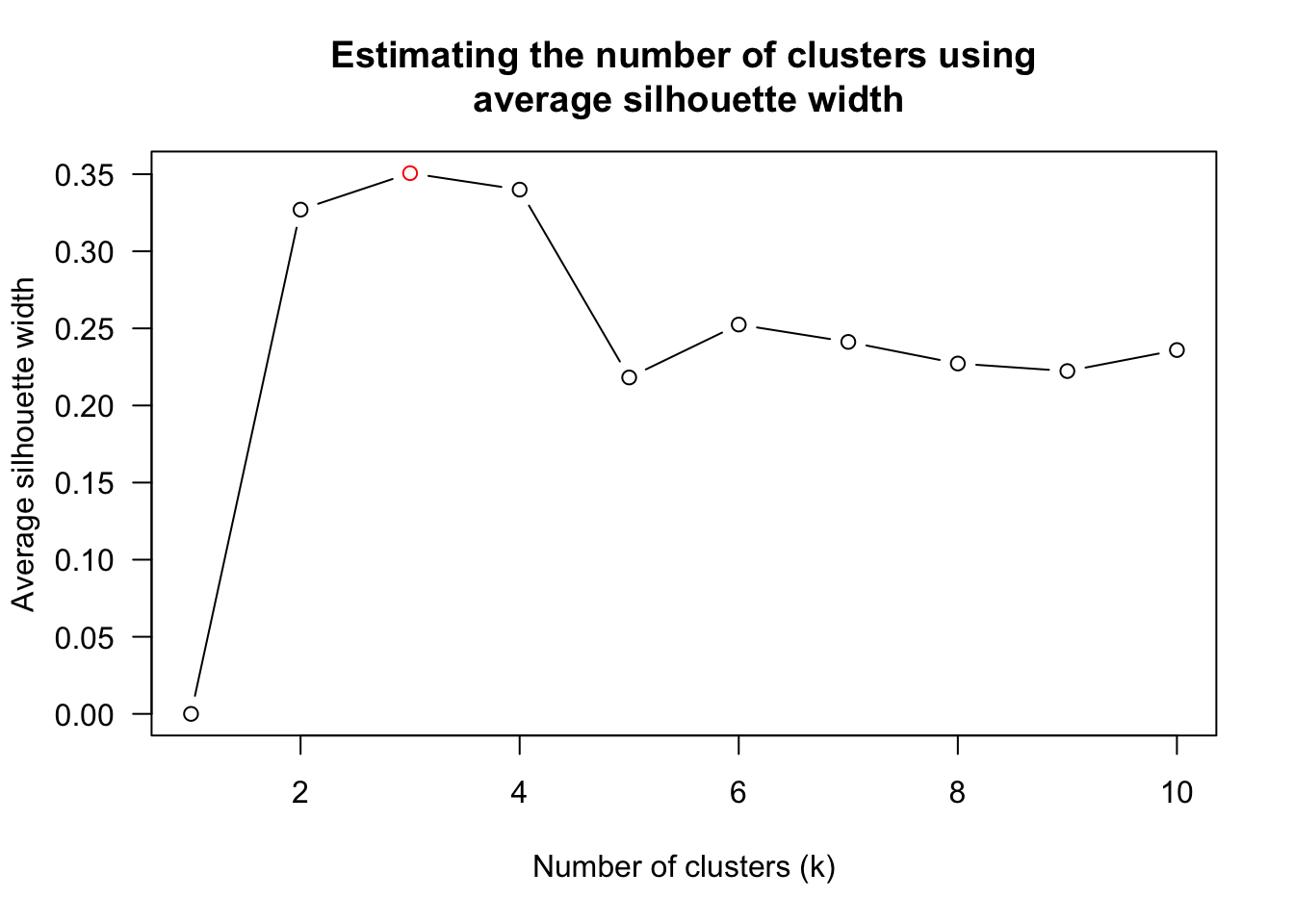
heatmaply(normalize(wh_matrix[, -c(1, 2, 4, 5)]),
          dist_method = "euclidean",
          hclust_method = "average",
k_row = 3)heatmaply(normalize(wh_matrix[, -c(1, 2, 4, 5)]),
seriate = "OLO")heatmaply(normalize(wh_matrix[, -c(1, 2, 4, 5)]),
seriate = "GW")heatmaply(normalize(wh_matrix[, -c(1, 2, 4, 5)]),
seriate = "mean")heatmaply(normalize(wh_matrix[, -c(1, 2, 4, 5)]),
seriate = "none")heatmaply(normalize(wh_matrix[, -c(1, 2, 4, 5)]),
seriate = "none",
colors = Blues)heatmaply(normalize(wh_matrix[, -c(1, 2, 4, 5)]),
Colv=NA,
seriate = "none",
colors = Blues,
k_row = 5,
margins = c(NA,200,60,NA),
fontsize_row = 4,
fontsize_col = 5,
main="World Happiness Score and Variables by Country, 2018 \nDataTransformation using Normalise Method",
xlab = "World Happiness Indicators",
ylab = "World Countries"
)Visual Multivariate Analysis with Parallel Coordinates Plot
pacman::p_load(GGally, parallelPlot, tidyverse)wh <- read_csv("data/WHData-2018.csv")ggparcoord(data = wh,
columns = c(7:12))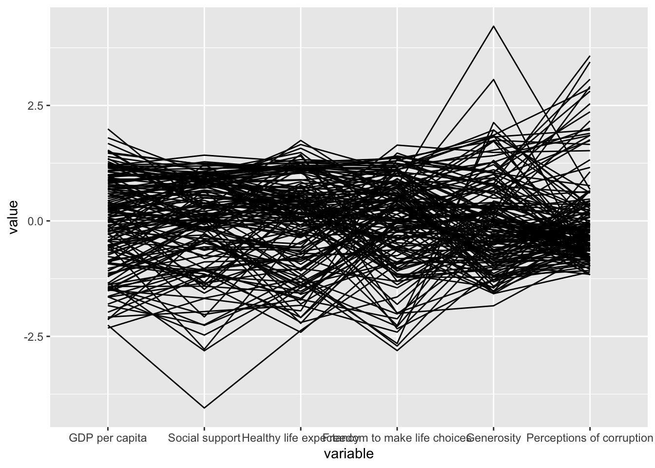
ggparcoord(data = wh,
           columns = c(7:12),
           groupColumn = 2,
           scale = "uniminmax",
           alphaLines = 0.2,
           boxplot = TRUE,
           title = "Parallel Coordinates Plot of World Happines Variables")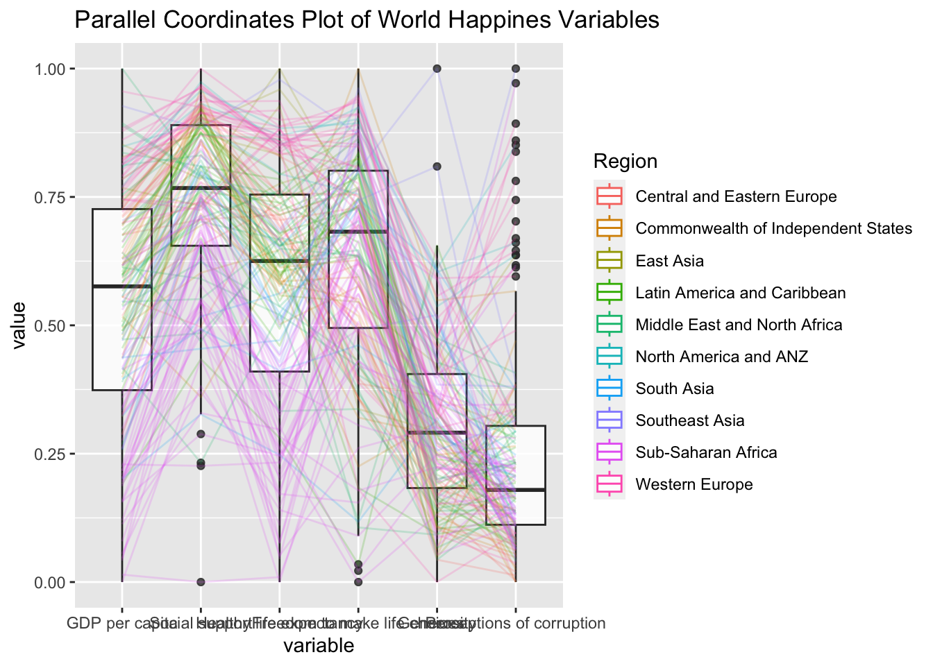
ggparcoord(data = wh,
           columns = c(7:12),
           groupColumn = 2,
           scale = "uniminmax",
           alphaLines = 0.2,
           boxplot = TRUE,
           title = "Multiple Parallel Coordinates Plots of World Happines Variables by Region") +
  facet_wrap(~ Region)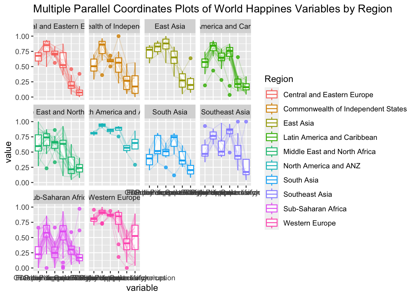
ggparcoord(data = wh,
           columns = c(7:12),
           groupColumn = 2,
           scale = "uniminmax",
           alphaLines = 0.2,
           boxplot = TRUE,
           title = "Multiple Parallel Coordinates Plots of World Happines Variables by Region") +
  facet_wrap(~ Region) +
  theme(axis.text.x = element_text(angle = 30))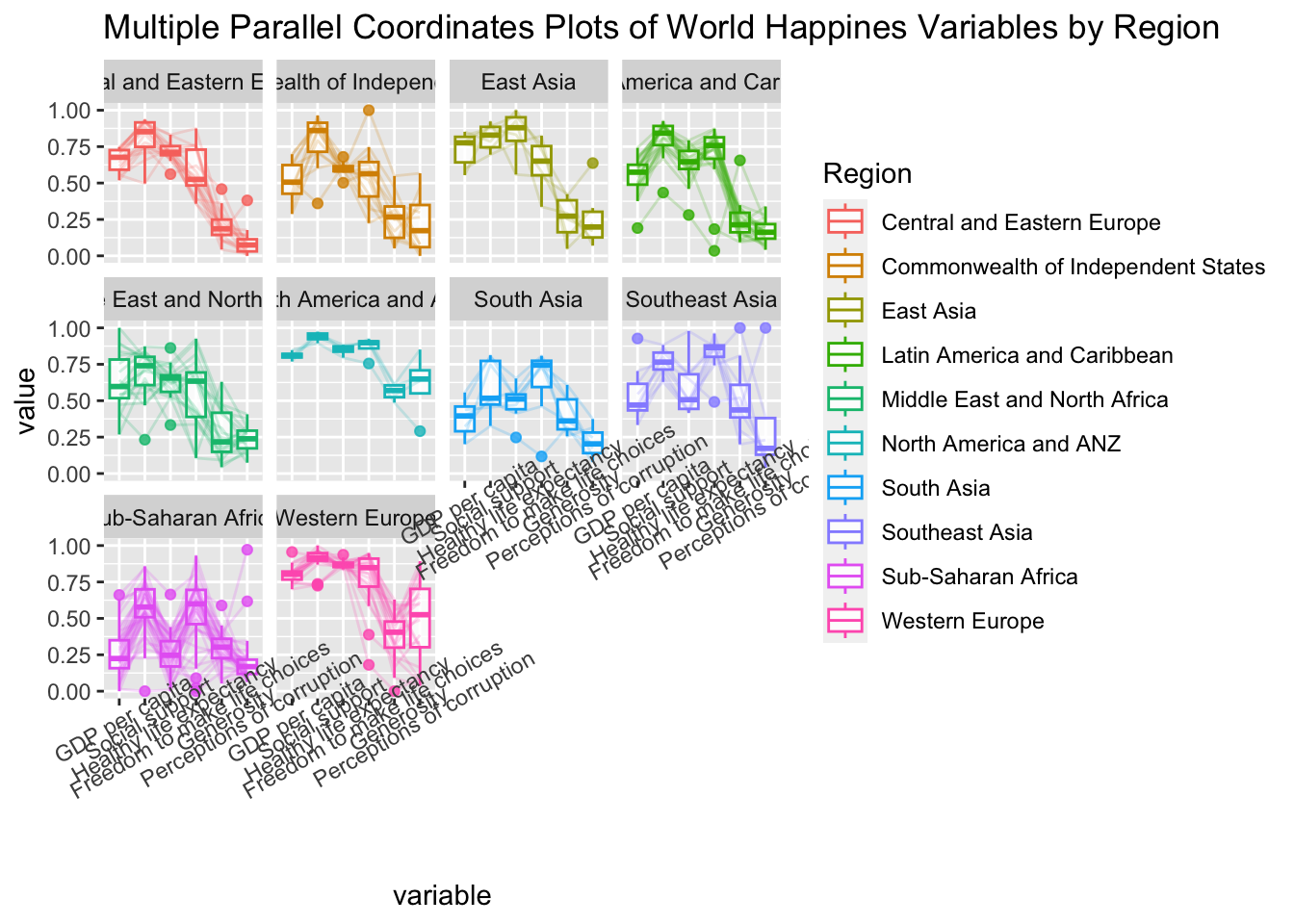
ggparcoord(data = wh,
           columns = c(7:12),
           groupColumn = 2,
           scale = "uniminmax",
           alphaLines = 0.2,
           boxplot = TRUE,
           title = "Multiple Parallel Coordinates Plots of World Happines Variables by Region") +
  facet_wrap(~ Region) +
  theme(axis.text.x = element_text(angle = 30, hjust=1))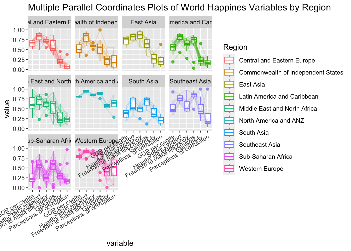
wh <- wh %>%
  select("Happiness score", c(7:12))
parallelPlot(wh,
             width = 320,
height = 250)parallelPlot(wh,
rotateTitle = TRUE)parallelPlot(wh,
continuousCS = "YlOrRd",
rotateTitle = TRUE)histoVisibility <- rep(TRUE, ncol(wh))
parallelPlot(wh,
rotateTitle = TRUE,
histoVisibility = histoVisibility)Treemap Visualisation with R
pacman::p_load(treemap, treemapify, tidyverse) realis2018 <- read_csv("data/realis2018.csv")realis2018_grouped <- group_by(realis2018, `Project Name`,
`Planning Region`, `Planning Area`,
`Property Type`, `Type of Sale`)
realis2018_summarised <- summarise(realis2018_grouped,
`Total Unit Sold` = sum(`No. of Units`, na.rm = TRUE),
`Total Area` = sum(`Area (sqm)`, na.rm = TRUE),
`Median Unit Price ($ psm)` = median(`Unit Price ($ psm)`, na.rm = TRUE),
`Median Transacted Price` = median(`Transacted Price ($)`, na.rm = TRUE))realis2018_summarised <- realis2018 %>%
group_by(`Project Name`,`Planning Region`,
`Planning Area`, `Property Type`,
`Type of Sale`) %>%
summarise(`Total Unit Sold` = sum(`No. of Units`, na.rm = TRUE),
`Total Area` = sum(`Area (sqm)`, na.rm = TRUE),
`Median Unit Price ($ psm)` = median(`Unit Price ($ psm)`, na.rm = TRUE),
`Median Transacted Price` = median(`Transacted Price ($)`, na.rm = TRUE))realis2018_selected <- realis2018_summarised %>%
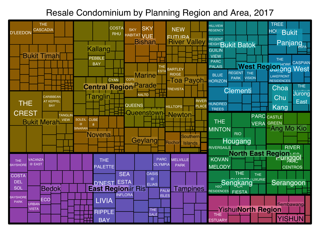
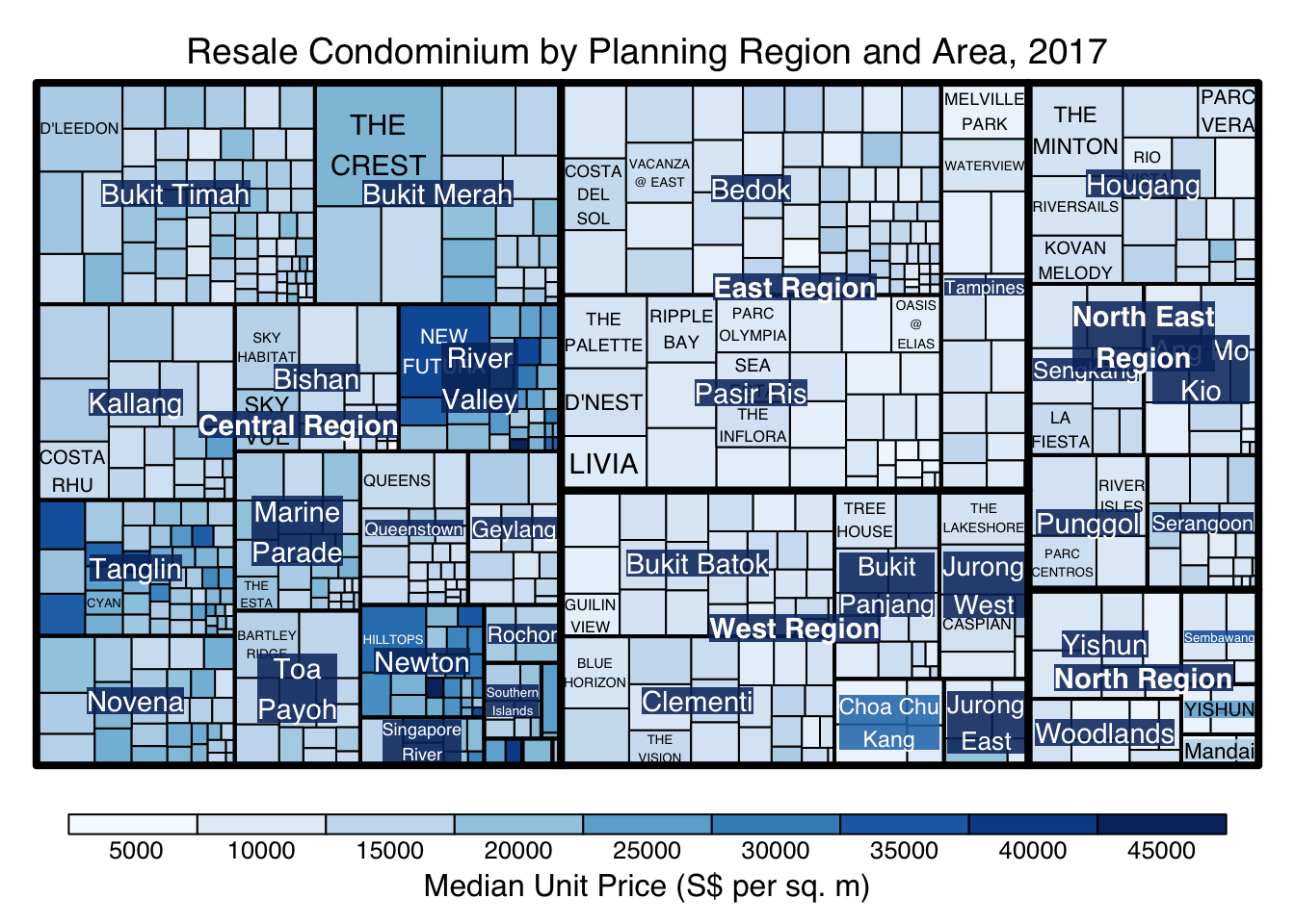
filter(`Property Type` == "Condominium", `Type of Sale` == "Resale")treemap(realis2018_selected,
index=c("Planning Region", "Planning Area", "Project Name"),
vSize="Total Unit Sold",
vColor="Median Unit Price ($ psm)",
title="Resale Condominium by Planning Region and Area, 2017",
title.legend = "Median Unit Price (S$ per sq. m)"
)
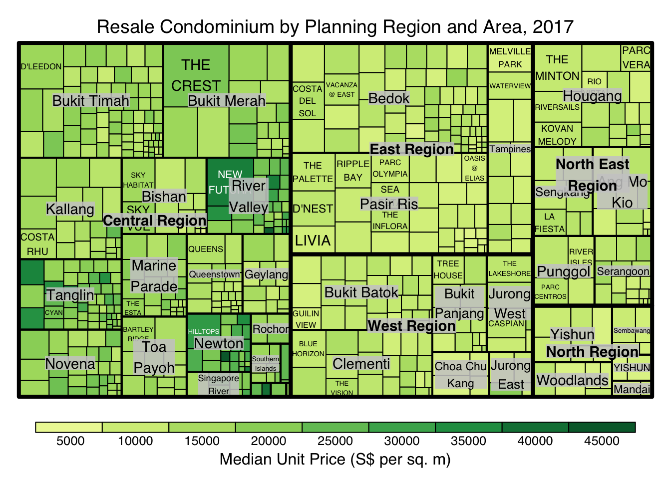
treemap(realis2018_selected,
        index=c("Planning Region", "Planning Area", "Project Name"),
        vSize="Total Unit Sold",
        vColor="Median Unit Price ($ psm)",
        type = "value",
        title="Resale Condominium by Planning Region and Area, 2017",
        title.legend = "Median Unit Price (S$ per sq. m)"
        )
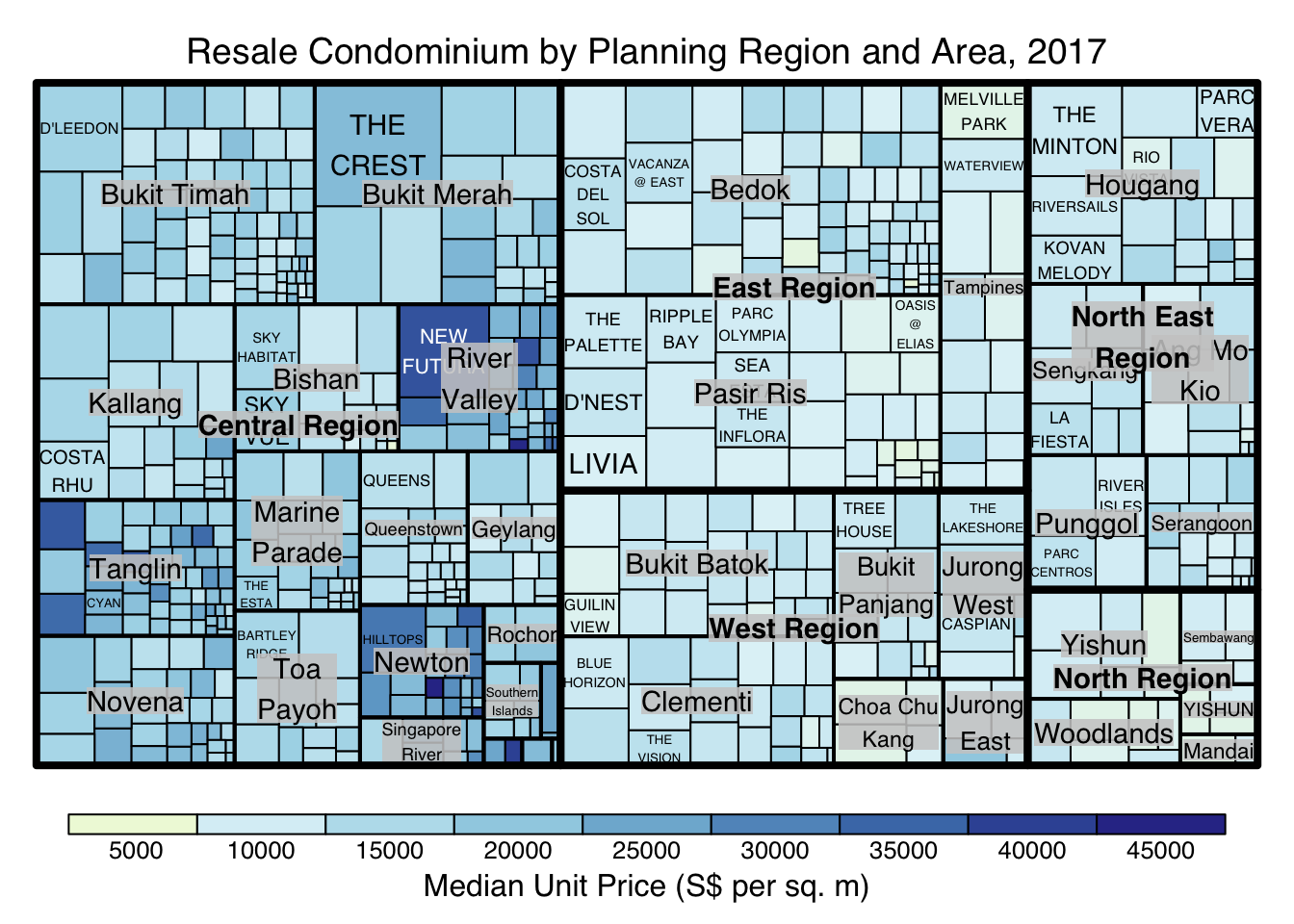
treemap(realis2018_selected,
        index=c("Planning Region", "Planning Area", "Project Name"),
        vSize="Total Unit Sold",
        vColor="Median Unit Price ($ psm)",
        type="value",
        palette="RdYlBu",
        title="Resale Condominium by Planning Region and Area, 2017",
        title.legend = "Median Unit Price (S$ per sq. m)"
        )
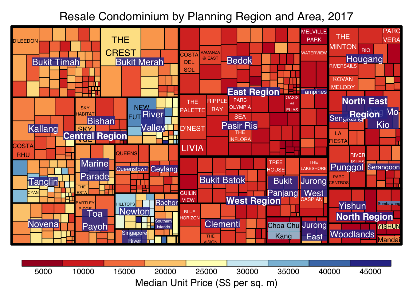
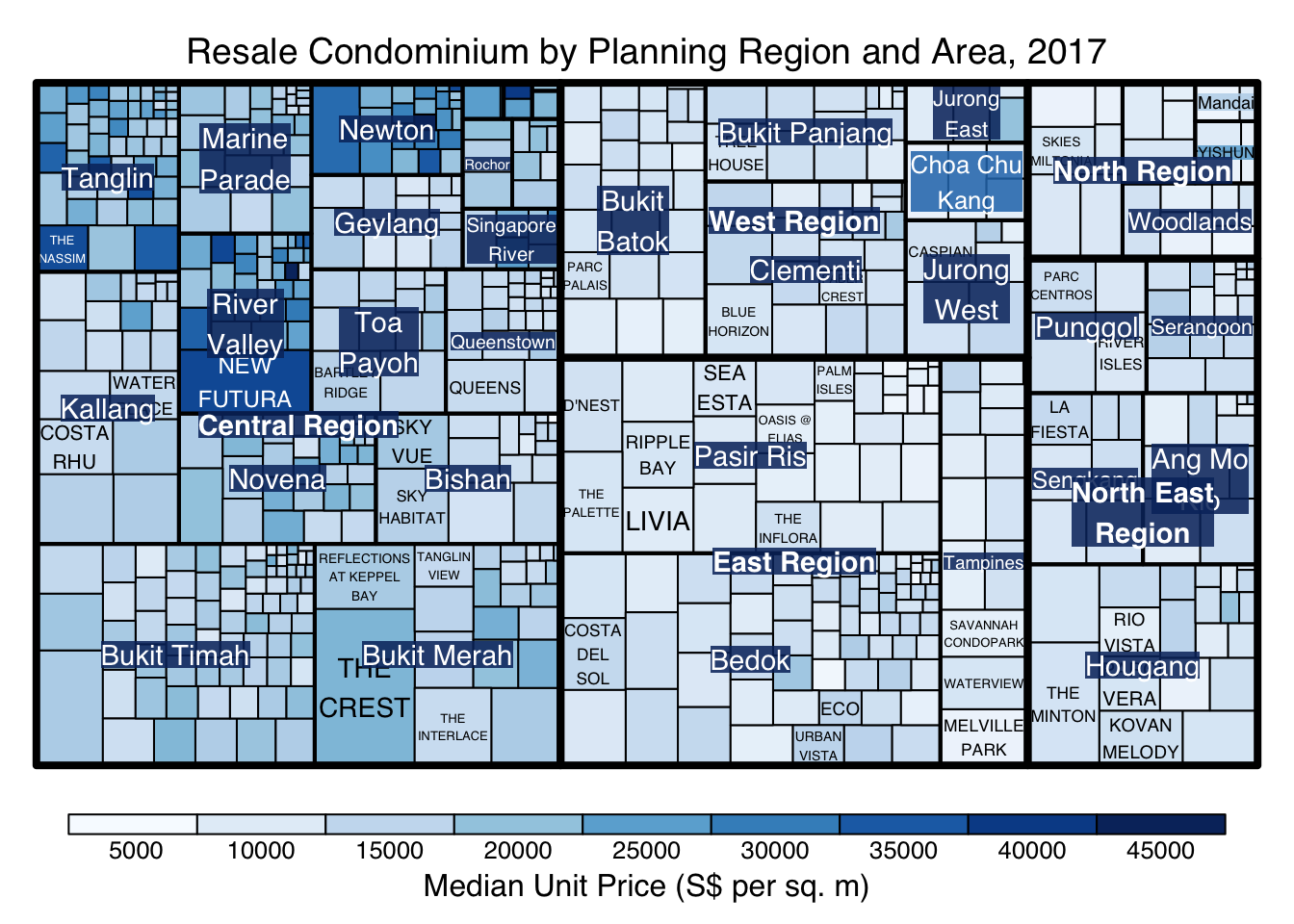
treemap(realis2018_selected,
        index=c("Planning Region", "Planning Area", "Project Name"),
        vSize="Total Unit Sold",
        vColor="Median Unit Price ($ psm)",
        type="manual",
        palette="RdYlBu",
        title="Resale Condominium by Planning Region and Area, 2017",
        title.legend = "Median Unit Price (S$ per sq. m)"
        )
treemap(realis2018_selected,
        index=c("Planning Region", "Planning Area", "Project Name"),
        vSize="Total Unit Sold",
        vColor="Median Unit Price ($ psm)",
        type="manual",
        palette="Blues",
        title="Resale Condominium by Planning Region and Area, 2017",
        title.legend = "Median Unit Price (S$ per sq. m)"
        )
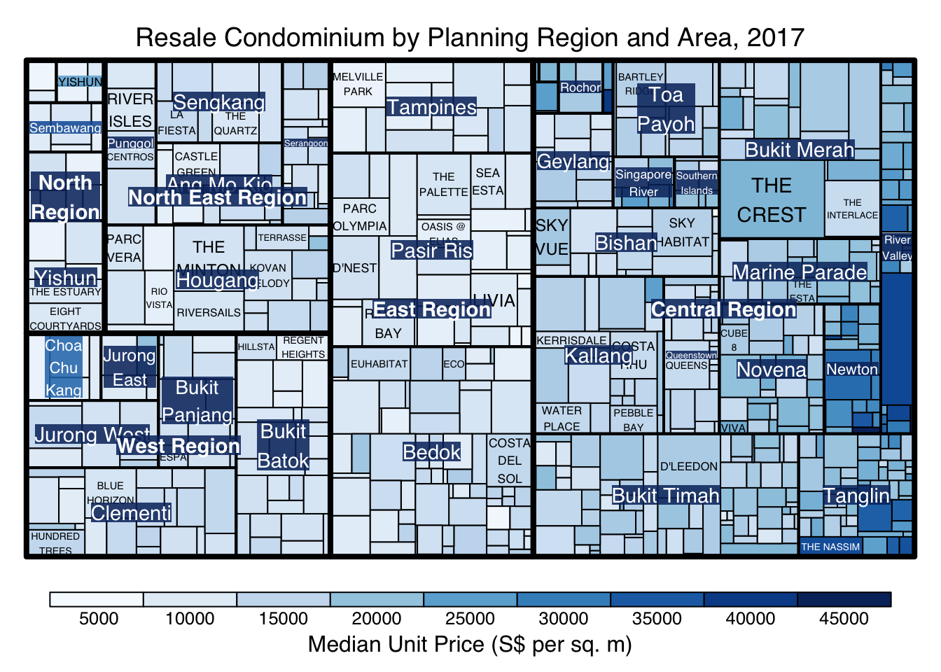
treemap(realis2018_selected,
        index=c("Planning Region", "Planning Area", "Project Name"),
        vSize="Total Unit Sold",
        vColor="Median Unit Price ($ psm)",
        type="manual",
        palette="Blues",
        algorithm = "squarified",
        title="Resale Condominium by Planning Region and Area, 2017",
        title.legend = "Median Unit Price (S$ per sq. m)"
        )
treemap(realis2018_selected,
        index=c("Planning Region", "Planning Area", "Project Name"),
        vSize="Total Unit Sold",
        vColor="Median Unit Price ($ psm)",
        type="manual",
        palette="Blues",
        algorithm = "pivotSize",
        sortID = "Median Transacted Price",
        title="Resale Condominium by Planning Region and Area, 2017",
        title.legend = "Median Unit Price (S$ per sq. m)"
        )
ggplot(data=realis2018_selected,
       aes(area = `Total Unit Sold`,
           fill = `Median Unit Price ($ psm)`),
       layout = "scol",
       start = "bottomleft") +
  geom_treemap() +
  scale_fill_gradient(low = "light blue", high = "blue")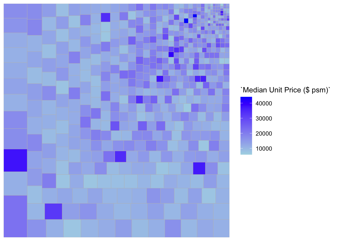
ggplot(data=realis2018_selected,
       aes(area = `Total Unit Sold`,
           fill = `Median Unit Price ($ psm)`,
           subgroup = `Planning Region`),
       start = "topleft") +
  geom_treemap()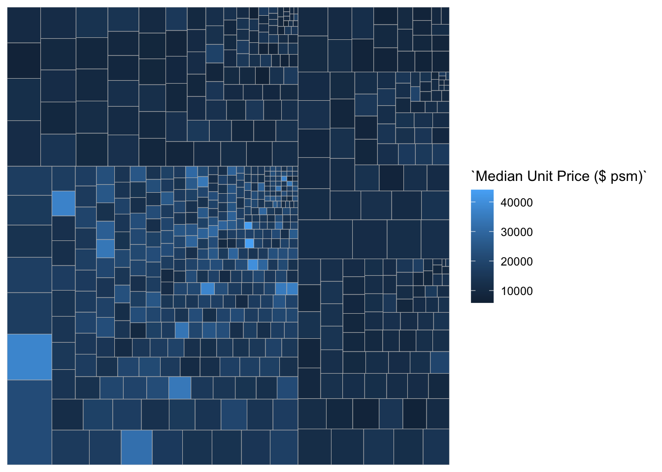
ggplot(data=realis2018_selected,
       aes(area = `Total Unit Sold`,
           fill = `Median Unit Price ($ psm)`,
           subgroup = `Planning Region`,
           subgroup2 = `Planning Area`)) +
  geom_treemap()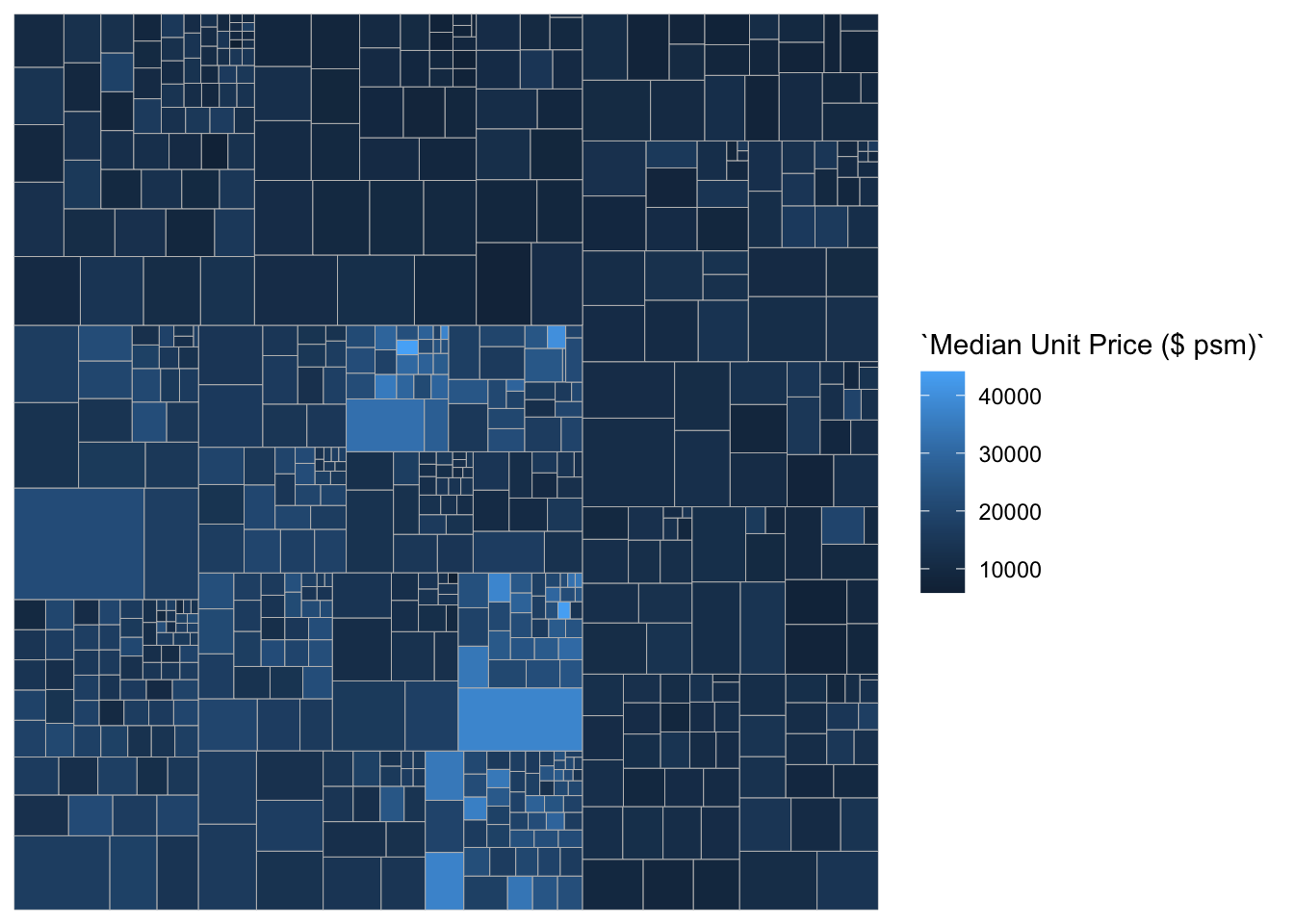
ggplot(data=realis2018_selected,
       aes(area = `Total Unit Sold`,
           fill = `Median Unit Price ($ psm)`,
           subgroup = `Planning Region`,
           subgroup2 = `Planning Area`)) +
  geom_treemap() +
  geom_treemap_subgroup2_border(colour = "gray40",
                                size = 2) +
  geom_treemap_subgroup_border(colour = "gray20")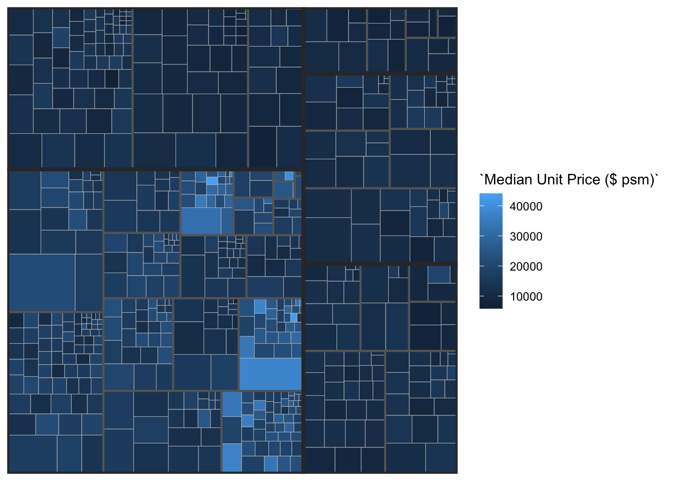
library(devtools)
install_github("timelyportfolio/d3treeR")library(d3treeR)tm <- treemap(realis2018_summarised,
index=c("Planning Region", "Planning Area"),
vSize="Total Unit Sold",
vColor="Median Unit Price ($ psm)",
type="value",
title="Private Residential Property Sold, 2017",
title.legend = "Median Unit Price (S$ per sq. m)"
)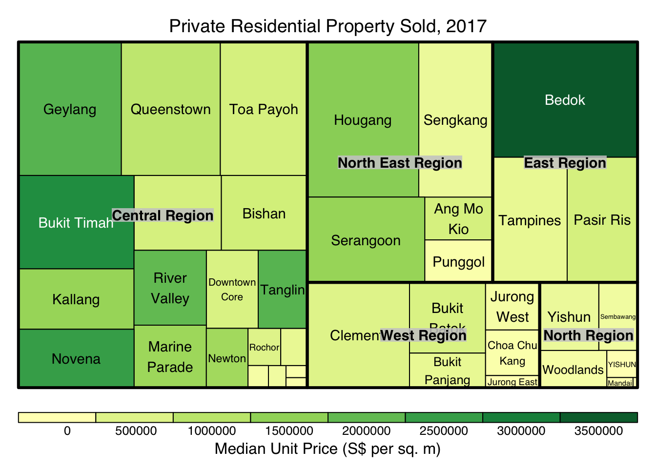
d3tree(tm,rootname = "Singapore" )